


Introduction
Nowadays, people use their smartphones more than ever. They’re convenient and compact. According to research done by Similarweb, over 60% of global traffic now comes from mobile devices. Since so many people use their phones for everything, websites need to work well on mobile too. But, some of you don’t get it right because of few common mobile SEO mistakes. This makes it harder for them to show up in Google searches on phones.
Importance of mobile SEO
SEO has always been crucial for online content because it impacts how your content ranks on Google search and other search engines like Bing or DuckDuckGo. Ensuring your website and content are optimized for mobile visitors is now super important. Search engines prefer mobile-friendly sites when ranking for keywords. If not properly optimized for mobile devices, your site could lose a ton of potential traffic.
Mobile optimization also affects user behavior— sites that are easy to navigate and load faster on mobile devices tend to have lower bounce rates and higher engagement metrics.
Common mistakes
SEO is a super broad topic. In many cases, optimizing for desktop and mobile or tablet devices is quite similar. One of the most common mobile SEO mistakes is not using a responsive theme. A responsive theme adjusts your content automatically to fit different screen sizes. Users searching on mobile expect quick answers, so if your site loads slowly, you’ll miss out on engagement. In this blog, we’ll discuss common SEO mistakes and how to fix them.
1. Slow Site Speed
Mobile users often search on the go, without stable internet connections like desktop users. It’s crucial to ensure your site loads quickly on mobile because while it might work fine on desktops, mobile devices require a different optimization approach.
Impact on UX and SEO
Site speed is a critical factor for both user experience (UX) and search engine optimization (SEO). Even a 1 second delay can frustrate visitors and decrease the likelihood of them staying on your site. When visitors leave your site quickly, it increases the bounce rate, which reduces the average time spent on a page. Google and other search engines use these metrics to assess site quality. Slow websites are usually ranked lower because search engines prioritize user experience, and loading time is a significant part of that assessment.
Fixes: Image optimization, caching
Many factors can make your site slow. We suggest starting with the image optimization part. High-quality pictures look good on eyes, but good things come with a cost (larger file sizes). Larger files require more bandwidth to load.
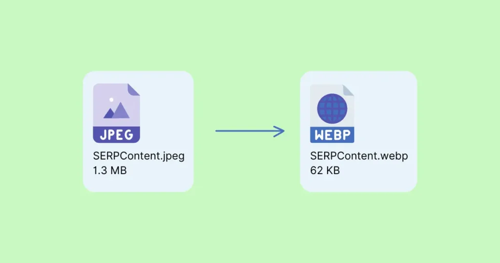
Compress your images as much as you can while keeping them clear. If your image has small text, like an infographic, check it on various devices to ensure it’s readable everywhere. For images, the WebP (.webp) format is best for keeping file sizes low without losing quality. You can compress images using online tools like TinyPNG or plugins like Optimole or ShortPixel. To convert jpeg/jpg/png to WebP, try websites like Cloud Convert. If using WordPress, plugins like WP-Optimize may help, but remember, too many plugins can slow down your site too.
2. Unresponsive Design
The term ‘Responsive Design’ isn’t just another buzzword in the market; it’s essential for user retention and SEO performance. As mentioned before, since over half of the web is browsed on mobile devices, having a website that adapts fluidly across various screen sizes is a must.
Need for mobile-friendly design

Unresponsive design = bad user experience. For instance, if your site is built only for desktops, mobile readers might need to scroll horizontally to view your site’s content. Sometimes, the text can be too small to read. All these issues lead to a higher bounce rate. A high bounce rate is a red flag for search engines. They interpret high bounce rates as low-value content, which severely harms your search ranking.
Fixes: Responsive design principles
Search engines favor websites that are mobile-first. In 2020, Google officially announced mobile-first indexing for the whole web. This means Google will increase its crawling of websites using a mobile user agent (pretending to be a smartphone) and prioritize mobile versions of pages in its search index. Ensure your website uses the same URL for all devices it serves.
Make sure your content is accessible to Google’s bot crawlers. How? Use the same robots meta tags on both mobile and desktop sites. If you use different robots meta tags on the mobile site (especially the noindex or nofollow tags), Google might fail to crawl and index your page under mobile-first indexing. Also, ensure Google can see lazy-loaded content, which requires user interaction like swiping or clicking. In short, whatever content is on the desktop version of your site also needs to be on the mobile version, in a responsive way. Google has a page full of instructions on what to do and what not to do regarding this. If you have time, you can check out the mobile-first indexing best practices here.
3. Poor User Experience (UX)
As mentioned earlier, since the majority of visitors come from smartphones, there are also users visiting the web from tablets or other devices. Laptops or desktop computers don’t affect user experience as much, regardless of their size, typically between 13 to 21 inches. The real struggle comes for smartphone and tablet users. A common issue impacting mobile user experience (UX) is the presence of small and hard-to-click links.
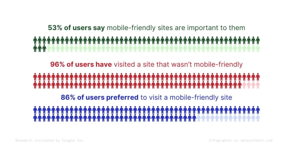
According to research done by Google, as shown in the infographic, 86% of total web visitors prefer a mobile-friendly site. Interestingly, 61% of users are unlikely to return to a mobile site they had trouble accessing, and 40% visit a competitor’s site instead. So, this is more important than ever.
Small text, hard-to-click links
We’ll be talking a lot about bounce rates in this guide. Small text and hard-to-click links can frustrate your website’s visitors. This frustration impacts your site’s bounce rate, which directly affects SEO rankings. If visitors struggle to read content or click on links, they’re likely to leave your site without interacting. This sends a signal to search engines that your website may not provide value. Google’s mobile-first indexing means the search engine primarily uses the mobile version of a website for indexing and ranking. Websites not optimized for mobile UX risk losing visibility in search results.
Fixes: Adjust font size, increase button size
If you want your web content to look great on all screens, adjusting font sizes and button dimensions is the key. This helps fit different screen sizes. For mobile designs, it’s good to use fonts at least 16 pixels for body text. Also, make sure buttons and links are big enough to click easily without zooming. By doing this, you can greatly reduce your site’s bounce rate.
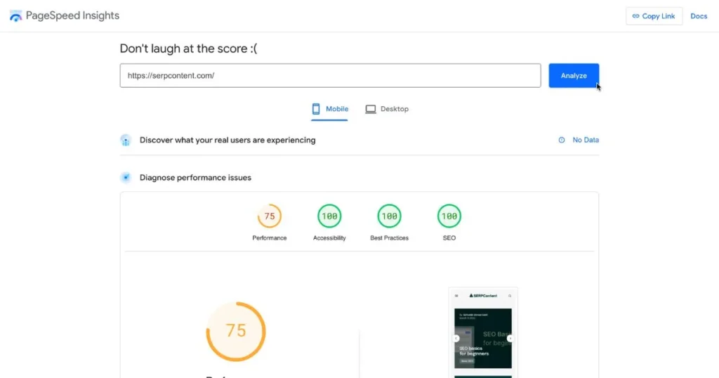
Google’s mobile-friendly test tool, known as PageSpeed Insights, helps find issues on your site for mobile screens. It’s really easy to use. Just enter your URL and click ‘analyze’. In a minute, it will point out problems on your mobile and desktop sites and suggest how to fix them.
4. Blocked JavaScript, CSS, and Image Files
In the early days of SEO, it was common to block JavaScript, CSS, and image files from being crawled by Google or any other search engine. The main idea was to keep search engines focused on content, not design. But don’t make that mistake now; it’s outdated and harmful for your site. Search engines like Google rely on these elements to crawl and understand your website better and see how it appears to visitors. Blocking these important resources can prevent search engines from accurately rendering and indexing your site.
If resources like JavaScript or CSS in separate files are blocked so that Googlebot can’t retrieve them, our indexing systems won’t be able to see your site like an average user. We recommend allowing Googlebot to retrieve JavaScript and CSS so that your content can be indexed better. This is especially important for mobile websites, where external resources like CSS and JavaScript help our algorithms understand that the pages are optimized for mobile.
Problem with blocking search engine indexing

If search engines can’t access JavaScript, CSS, or image files on your site, they might not fully understand its structure, design, or content quality. For example, if a search engine can’t crawl your site’s images correctly, your pages won’t be properly indexed. This could lead to missing out on image search rankings. From small details to overall site visibility, it can have a big impact.
Fixes: Update robots.txt
The robots.txt file is crucial for your site. It affects how search engines interact with your site. To make sure your JavaScript, CSS, or image files aren’t blocked by search engines, check your robots.txt file carefully and update it as needed. This doesn’t just improve how your site looks in search engine results (SERPs); it also makes it more attractive to your visitors. Use Google Search Console‘s URL Inspection tool to spot and fix issues with your robots.txt file easily. This is an essential part of mobile SEO for your website, so don’t ignore it.
5. Unplayable Content
If you have a content-heavy site, especially with videos, and they don’t play properly, it significantly hampers the overall user experience of the visitors. If your content uses old technologies like Flash, most smartphones or tablets won’t support it. Unsupported formats lead to visitor frustration. Frustration = increase in bounce rate and a decrease in engagement and content shareability.
Issue with non-supported content on mobile

If visitors find unplayable content on your website, the immediate impact would be frustration. Thinking long-term, this could seriously harm your website’s success. Your target audience will likely visit a competitor’s website instead. Also, there’s a negative impact on your site’s ranking by search engines. Almost every search engine, including Google, prioritizes user experience in their ranking algorithms. So, if your site has unplayable content, it is likely to see a significant drop in search engine rankings. Moreover, with Google’s mobile-first indexing, having mobile-compatible content is now critical for how a site is indexed and ranked.
Fixes: Use HTML5, mobile-supported video formats
The easiest solution is to use formats like HTML5 for video and multimedia content. HTML5 works on all major browsers, including desktop and mobile devices. This makes your content accessible to a wide audience. You can also use formats like MP4 (.mp4) for mobile. Even the World Wide Web Consortium (W3C) suggests HTML5 for embedding multimedia in your site. It offers a more accessible and reliable experience. Plus, Google PageSpeed Insights helps find issues on mobile-friendly sites. We’ll talk more about this later in the blog.
6. Interstitial Ads
Before we dive in, let me ask you, what is an interstitial ad? Interstitial ads are full-screen ads that cover the interface of their host website or app. They can significantly lower the user experience on mobile devices. These ads are especially troublesome on mobile devices with limited screen space, making them feel more intrusive than their desktop counterparts.
Intrusive interstitials and dialogs are page elements that obstruct users’ view of the content, usually for promotional purposes. Websites often need to show dialogs for various reasons; however, interrupting users with intrusive interstitials may frustrate them and erode their trust in your website. Use banners instead of interstitials.
This fits with the wider trend of prioritizing user experience in SEO rankings.
Intrusive ads hurt mobile SEO
The main issue with interstitial ads is they disrupt the visitor’s overall browsing experience. If used too much, visitors often leave the site out of frustration. This not only reduces the effectiveness of the ads themselves but also increases the bounce rate. As you may already know, a high bounce rate negatively affects SEO and sends a bad signal to search engines about your website. If a visitor has a low-spec device or slow internet, these ads can make the content almost inaccessible. I’m sure you don’t want that to happen to your visitors, do you?
Fixes: Less invasive ads, easy closure

To avoid the negative effects of interstitial ads on mobile SEO, consider using less invasive ads. Choose ads that are easy to dismiss or that offer a quick way to close them. Adding a delay before showing an interstitial ad helps too. It won’t pop up right away when someone opens a page, reducing annoyance.
Google recommends using ad formats like banners or sticky ads. These are less annoying and don’t hurt your mobile SEO. By following these tips, you can keep your ad income and still offer a good user experience. This also meets SEO rules, which leads to better engagement, keeps users coming back, and improves your site’s ranking.
7. Mobile-Only 404s
Encountering a 404 error on mobile browsers can be very frustrating. Mobile-only 404s often happen when a site uses separate URLs for mobile and desktop content. This issue can also arise from improperly configured redirects. Such problems negatively impact the user experience. Addressing mobile-only 404 errors is vital for maintaining a positive user experience and an effective SEO strategy.
404 errors on mobile versions

Mobile-only 404 errors can lead users to give up their search or go to competitor sites for information. From an SEO perspective, these errors make a site seem less reliable or of lower quality, which negatively affects search rankings.
Fixes: Consistent URL structure, audit for 404s
To avoid mobile-only 404 errors, websites should use a consistent URL structure across devices. If you use a responsive web design, there’s no need for separate URLs for mobile and desktop content, reducing the chances of 404 errors. For sites that must use separate URLs, proper redirects and link configuration are essential to prevent mobile-only 404 errors. Regularly auditing your site for any errors is also a very good practice. Tools like Google Search Console can help identify and fix these issues quickly. Setting up informative and user-friendly custom 404 pages can help guide users back to relevant content, reducing bounce rates.
8. Ignoring Local SEO
Implementing local SEO strategies is a smart move in digital marketing. It’s especially useful if you want to draw in local customers to your site for your product or service. If your content is optimized for local searches, you’re likely to rank higher in search results for local queries. A report by BrightLocal shows that 93% of consumers used the Internet to find local businesses, with 34% searching every day. This underlines the increasing importance of local SEO, as consumers depend on online searches to decide where to shop, eat, or get services. Local SEO not only boosts your online visibility but also increases foot traffic and online inquiries from potential customers in your area.
Optimizing for local searches

If you ignore local SEO, you might miss out on chances to connect with your target audience. Not using a proper local SEO strategy means your business might not show up in local search results or on Google Maps. This makes it tough for potential customers to find you. It could also mean fewer website visits or in-store visits, and ultimately, lost revenue. Competitors who focus on local SEO will likely do better, grabbing a bigger piece of the local market. In today’s tough digital world, not optimizing for local searches can really hurt a business’s chance to grow and succeed locally.
Fixes: NAP consistency, local keywords
To ensure and improve local SEO, your business should make sure it has its name, address, and phone number (NAP) consistently across all platforms. This consistency helps Google verify your business’s legitimacy and improves rankings in local search results. Also, try incorporating local keywords into your website content, meta tags, and listings. This enhances your business’s visibility for local searches. Implementing these strategies, along with a Google Business Profile listing, will greatly improve your business’s local SEO. It will make your business more visible to consumers searching for local options.
9. Faulty Redirects and Cross-Linking Issues
Incorrect redirects occur when mobile users are directed to an irrelevant page or homepage, instead of the specific content they clicked on. Similarly, cross-linking issues arise when a mobile site links to desktop versions of pages (or vice versa). This confuses both users and search engines. Since Google’s ranking algorithm heavily emphasizes user experience, these issues can impact the site’s visibility in search results.
Incorrect redirects, irrelevant cross-links

Faulty redirects and improper cross-links lead to a higher bounce rate and reduced engagement. When users are misdirected, they often abandon their search entirely. This can decrease a website’s value in the eyes of search engines like Google. A decrease in value leads to lower rankings and less organic traffic. Most importantly, incorrect redirects can waste the crawl budget. This means search engines will crawl a limited number of pages on your site within a given timeframe. As a result, important content on your site may remain unindexed.
Fixes: Correct redirects, verify links
To fix these issues, implement the correct redirect that guides mobile users to the content they’re looking for. You can use an HTTP 301 redirect. This permanently moves content and also tells search engines that the mobile-friendly page is the authoritative version. For cross-linking, ensure links on mobile pages direct to mobile-friendly pages only. Desktop links should do the same. Regularly use tools like Google Search Console to make sure redirects and links are working correctly across devices.
10. Missing Structured Data
Structured data plays a very important role in mobile SEO. It helps search engines understand a webpage’s content. By giving clear clues about a page’s meaning, it classifies the content. This is especially important for mobile searches, where screen space is limited. Search engines use this data to show the most relevant results in formats like rich snippets. Snippets can show extra details such as ratings, prices, and availability directly in search results, without the need to open a webpage. According to HubSpot, pages with correctly formatted and implemented structured data saw a click-through rate (CTR) increase of up to 30%. This shows how necessary structured data is for your website.
Role of structured data in mobile SEO
If structured data is missing on our website, it misses out on the opportunity to be included in Google’s rich snippets. This can make the website less appealing compared to competitors who use structured data correctly. This can lead to lower click-through rates, less traffic, and an overall decrease in conversions. Not having structured data means search engines might not fully understand the content of our pages or website. In a world where being first indexed is the standard, missing structured data can significantly harm your site’s visibility in search results.
Fixes: Implement, test structured data

To benefit from structured data for mobile SEO, add schema markup to your website. Schema.org offers a shared vocabulary that major search engines like Google, Bing, and Yahoo understand. This makes it easier for them to recognize structured data and improve search listings. After adding structured data, test it with tools like Schema Markup Validator or Google’s Rich Results Test. This ensures it’s formatted correctly and recognized by search engines. It’s also good to regularly check and update your structured data. This keeps your SEO strategy effective, matching changes in search engine algorithms.
11. Not Monitoring Mobile Usability
As you already know, mobile devices dominate the web. Nowadays, Google’s mobile-first indexing is the standard. In this era, you cannot underestimate the importance of continuously monitoring and testing your site’s mobile usability. It’s essential to test regularly to make sure your visitors have a smooth experience, no matter their device type.
53% of web users leave sites that take more than 3 seconds to load. This fact highlights the importance and necessity of mobile optimization.
Continuous monitoring and testing
If you don’t monitor your site’s mobile visibility regularly, it can lead to a host of issues. These include slow loading times, unresponsive site design, and more. All of these lead to poor website performance in SEO. They also result in a higher bounce rate and bad user experience. We’ve already talked about these issues many times, so I won’t bore you again with the details. Let’s jump straight into the solutions.
Fixes: Google’s Mobile-Friendly Test, analytics tracking
There are various tools like GTmetrix, Google’s PageSpeed Insights, etc., that analyze your website’s load time and appearance on mobile and desktop devices. You can also dive into little details or issues about your site that directly impact your site’s SEO performance. We recommend using Google PageSpeed Insights to check your site’s performance on mobile devices.
This tool gives specific feedback on issues to improve mobile usability, such as setting up the viewport correctly, using legible font sizes, etc. By integrating Google Analytics in your website, you can track mobile usage patterns, loading times, and bounce rates. This offers insights into how users interact with your site on mobile devices. If you’re using WordPress to build and manage your website, you can just install Google’s Site Kit plugin.
12. Neglecting Content Optimization for Mobile
Engagement and readability of content on mobile devices are more important than you might think. Websites need to be more than just accessible; they must be customized for mobile viewing. Mobile users seek easily digestible information that fits smaller screens without the need for constant zooming or horizontal scrolling. Failing to do so can negatively impact mobile SEO.
Readable and engaging on mobile

The purpose of mobile content optimization is to create content that captures and retains the attention of mobile users. The content doesn’t need to be arranged in any specific way, but it must be high-quality and relevant. Studies have shown that mobile users have relatively shorter attention spans. For this reason, it’s essential for your content to be immediately engaging. To achieve this, use compelling headlines. Make sure key information is front-loaded to catch users’ interest right from the start.
Fixes: Optimize content layout, ensure mobile-friendliness
To make your content more accessible and engaging for mobile users, optimize your website layout. This means using shorter paragraphs, larger font sizes, and mobile-responsive themes that adjust to various screen sizes. Try implementing multimedia like images and videos to enhance engagement on your site. But, please make your site load quickly on mobile networks. Use tools like GTmetrix or Google PageSpeed Insight to identify issues if your site is slow on mobile devices.
Overview
To sum things up, no matter how many guides or tips and tricks we write, SEO remains a complex and vast topic. SEO guides need updates frequently due to Google’s or other search engines’ updates. To keep up, you need to stay informed about the best SEO practices. We have tried to cover the most common mobile SEO mistakes and how to fix them. Give these methods a try. We hope this helps you and your website. Also, We’ll try to update each piece of content regularly so you always have the latest information.
Frequently Asked Questions (FAQs)
Yes, SEO works on mobile too. The common practices for SEO are more or less the same across mobile and desktop. But, with over half of internet traffic coming from mobile devices, focusing more on mobile SEO is important. This includes paying attention to how your website looks on mobile devices. Follow SERPContent’s comprehensive guide to avoid common mobile SEO mistakes and boost your mobile SEO game.
The answer is both yes and no. You can practice SEO on almost any device with an internet connection. SEO isn’t a specific app or software limited to certain platforms. It’s more like a guideline. Using a mobile device, you can learn more about it through the SERPContent website, guides, or YouTube videos. However, for website development work, larger screens like those of laptops or desktops are recommended.
Yes, SEO is mobile-friendly. Google prioritizes mobile-friendly pages in search results (SERPs). Mobile SEO also depends on factors like location, responsiveness, readability, and optimization. You can learn more about mobile SEO on the SERPContent website.
Yes, while mobile SEO might be a bit different, it’s mostly the same as desktop SEO. In short, your website needs to load fast, be responsive across screens, and have good readability, among other important factors.
Yes, mobile speed affects SEO. Speed is a very important factor in SEO. Tools like Google PageSpeed Insights or GTmetrix can help you learn more about this.
Yes, it’s not recommended to rely entirely on AI for content. AI can be used as a tool. You can use it to speed up your writing or data collection process. But don’t use AI to completely generate or automate your content.
Hey, if you’ve read this and have come to the end of the blog, feel free to ask me anything regarding the content. I’ll be happy to answer. 😄